Thursday

Ireland Trip

A small group of us from print making got invited to go with David Ferry on a trip to Ireland, where we would go with him to an independent university in the Burren, set in an amazing landscape, built around an old Fortress, we were given a studio to set up a print department, Laura who is trained in solar printing would teach us the process and then teach students wanting to participate from the university


We spent the first few days exploring the environment we were in, in keeping with David's original idea of a synergy between a journey and the film the 'Seventh seal', we first took a journey up a mountain behind the university, and then watched the film. On our journey we all walked separately, we all took a different route, we all wondered off, stopped to draw, photograph, ponder, it felt never ending, it was exhausting, then finally we reached the top and we all congregated together. The landscape was incredible, like huge slabs of slate, all fitting together almost like a puzzle, I took a number of photographs, of us all stood in this vast space.
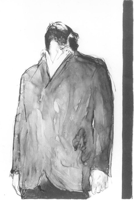
The film reflected a lot of the same experiences we had encountered on our journey, the idea of going alone and then meeting others, of experiencing something more somehow when with others. I feel an experience is heightened through sharing with others, it was interesting that the landscape almost looked like a chess board. I wanted to channel all of this into the print that I made, I wanted to include the people on my journey.

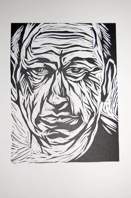
We were first taught about how we could make either a relief plate where we might draw or paint straight onto the plate and this creates a strong image, where once the plate is exposed under the UV light we could create an image that is more like a lino plate. Alternatively we could make an intaglio plate, where we would put down an aqua tint first.
Firstly we began by setting up the studio and creating a print studio within the university.


Painting of Michel Roux


This painting is the strongest from the work I have done so far, this was painted on oil paper, and I finished it in two sittings, I think it is more affective than my previous paintings as the skin is more believable, the way the face comes out of the paper shows how the light and dark has brought contours out into the viewers periphery. I think this painting shows I can sometimes manage the paint, the colours are not as harsh as the paintings I have done previously.

Thinking about line


Prints


This was a study I began on the cook Michel Roux, his face is extremely interesting I think, and I wanted to try and capture his frowns and wit into a print.

Drawings on grey paper


In the workshop with Rob and James at UWIC we did a series of exercises which made us think about 'how' we look, how we observe our subject matter, whether a person or an object, we must begin to identify which area is lightest, which as seen as darkest, and looking at these points will begin to open up the way we look at the subtle differences in the in-between parts, the tones. Also by forcing us in one task to not look directly at our subject but slightly away form them it trained our eye to pick up the essential points to draw, using only our periphery vision it engaged a technique of mapping out the pivotal points. It meant we did not worry about whether the drawing looked like the subject but more whether the simple shapes mimicked what our eye could see. 

Stephen Conroy

In looking for other artists I also found the artist Stephen Conroy, his paintings in some ways are similar in style to Michael Borrmans, he uses the paint in such a way that it subtly highlights the persons features. He also prints, I found some examples of his etchings, the etchings are incredible, the lyaers of line create contours of the face.


Looking at artists

Recently I have spent a large amount of time looking at other artists both print makers and painters, I have found some amazing artists I had not looked at before, some of whom have strongly inspired me.
One of these artist is Tony Bevan, who currently has an exhibition at the portrait gallery in London, I will make a trip down over the Easter to go and see this exhibition. The way he reduces the face to lines and creates such striking pieces, this is a true skill, I would like to be able to capture this type of linear quality in my own dry point prints, some of his work is achieved through mono printing, I think this type of printing is far more direct. It links more with painting and especially drawing. I had a go at mono printing as soon as I saw these images, this will be another method of printing I would like to explore more.


Experimenting with pencil drawing on grey paper. Using grey paper allows you to being with the lightest and darkest points of the face.

new painting


This painting is possibly an advance on my previous ones, I think it captures the tones and light and dark more subtly than my previous painting, for this I used hessian unprimed just sized with rabbit skin glue, I think perhaps I work better on a ground colour. I have therefore prepared more surfaces to work on  and have also begun working more quickly on just oil paper so as not to spend too long making canvas's in order to try and paint paint paint and progress.

Lino


I have begun to use lino as process for helping me to study the face and to try and look at light and dark. The way you cut away from the lino helps to force me to think in negative and to reduce images down to light and dark.  I really enjoy the mark making and the lines within the lino, the process is very satisfying and I think the results are affective and fairly striking. I want to try and capture some of this in my painting.